FocusVerse: Designing a Universe of Focus
FocusVerse is a web-based application designed to create an immersive focus environment that enhances personal growth and productivity.
Current State
An ongoing project that will evolve through iterative design and user feedback, with a focus on creating a unique, engaging, and effective productivity tool.
1. Project Overview and Vision
Understanding the problem space and defining our vision for the future of focus tools.
The Premise
In today's hyper-connected world, the ability to find deep, sustained focus is a superpower. However, existing productivity tools often lack warmth, are uninspiring, or become a source of distraction themselves.
The Vision
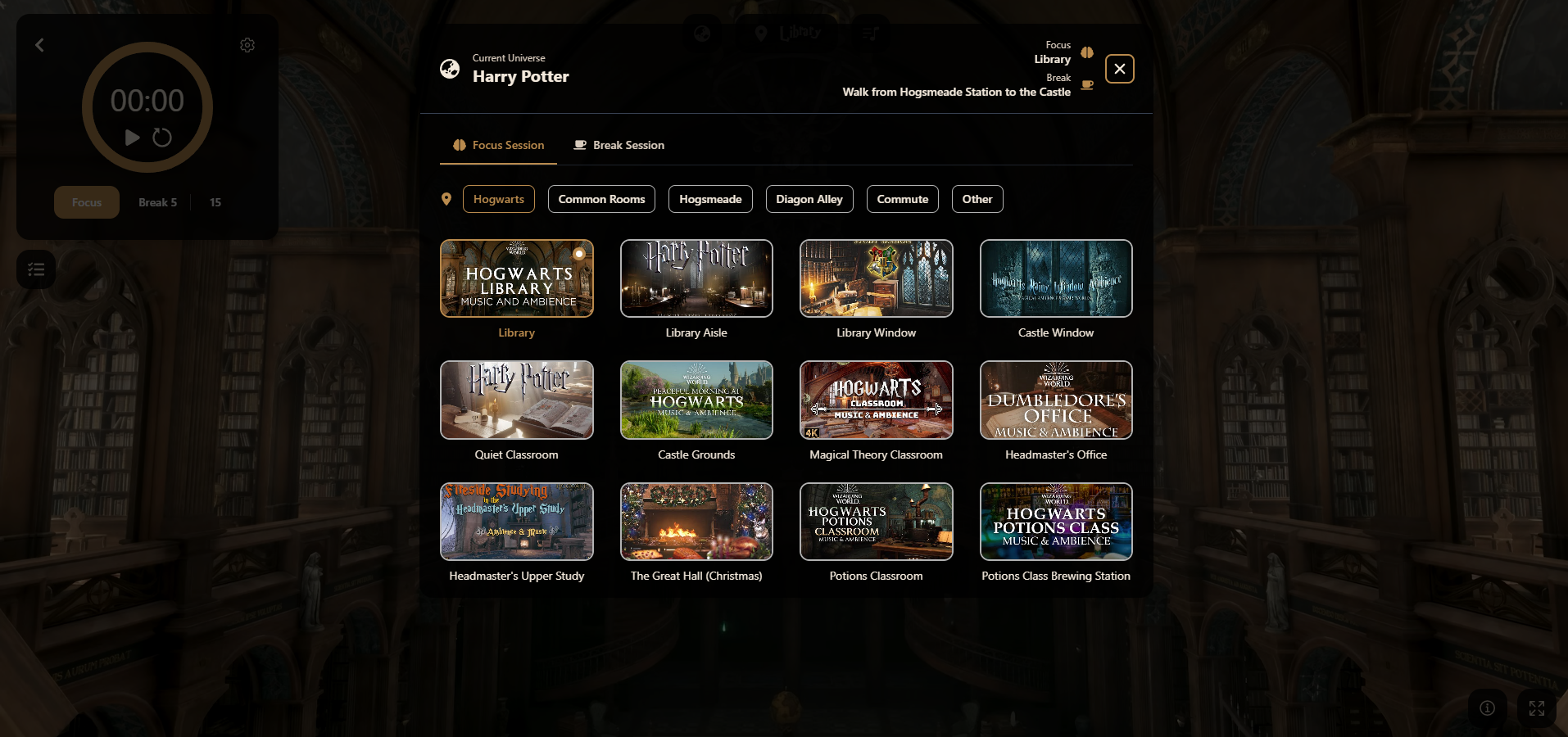
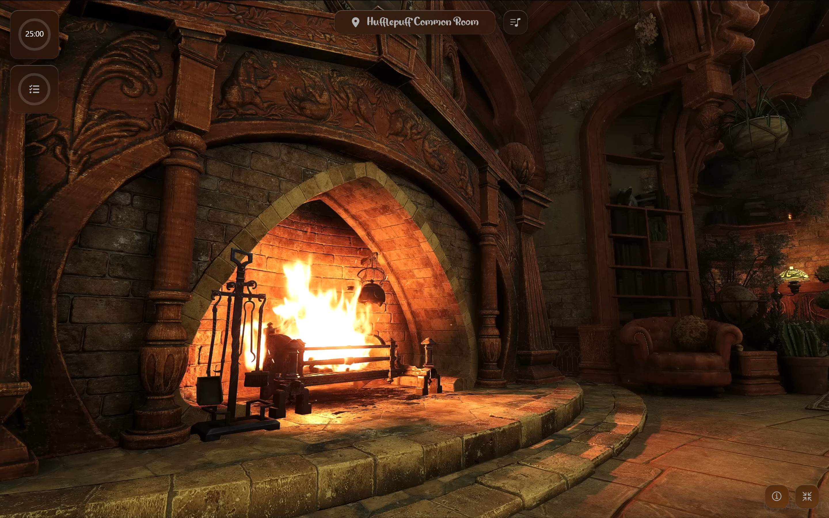
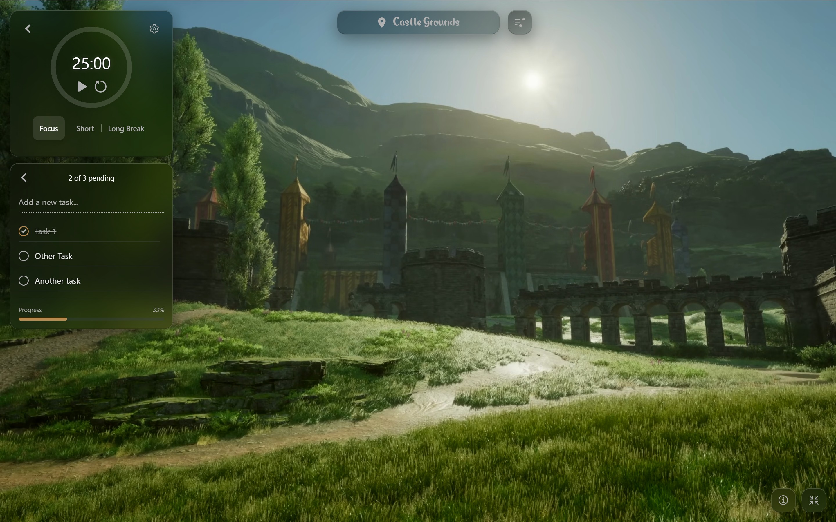
FocusVerse was designed to create more than just a task manager or timer. The goal was to build a sanctuary for the mind: a digital "universe" where users could escape distractions, immerse themselves in beautiful ambient environments, and access tools to accommodate their workflow.
Goals & Objectives
Clear goals from both user and business perspectives guided our design decisions.
📈 User Goals
- W.I.P.
🎯 Product/Business Goals
- W.I.P.
2. Problem and Target Group
This project arose from personal focus needs and wants, later expanding to the needs of others.
Problem
I noticed that I liked working with a focus environment with a nice background and instrumental music, with at times sound effects like a fireplace or rain. However, I noticed the productivity features in such existing applications being buggy and the "environment" was just a simple background. I kept going back to websites with only those features. This led to having to go to multiple websites/applications to get the features I wanted, which was not ideal.
The Target Group
Any student or professional who wants to create a personalized focus environment, with or without community features. The target group is broad, but the focus is on those who appreciate a distraction-free, immersive experience.
Meet Cahelle - Technical Consultant
"I need a space that helps me focus without overwhelming me with features. Sometimes I just want to feel like I'm studying in the Hogwarts library."
Goals: Better focus, less stress, aesthetic workspace
Frustrations: Complex tools, overwhelming interfaces, cold designs
Behavior: Using multiple apps, easily distracted by notifications
3. Competitor scan & insights
Researching competitors helped identify gaps and opportunities.
Summarized observations about competitors
- StudyVerse was taken offline, but had most cozy feeling.
- StudyTogether moved to Discord, had a buggy taskslist.
- LifeAt has core functions behind immediate paywall.
- PomoFocus has clear timer and tasklist, but no cosy features. No focus sessions together.
- CSW.live is not intuitive and is overwhelming.
- StudyStream has live camera and statistics, but no immersive features.
Missed features after StudyVerse shutdown
- Cozy, intuitive rooms.
- Built-in focus toolkit: dashboard with timer, to-dos, ambient music, camera and chat.
- Regular hangouts and meeting people to stay motivated together.
- Personal stats/history: people wished they’d had time to save/screenshot hours.
- A safe, private-feeling space (even if the tech behind it wasn’t perfect).
- Some liked the “study AI” and want it as an optional helper.
Opportunity: Combine cohesive cozy, immersive environments with robust features.
5. Personal Iteration: From Idea to First Concept
Before conducting formal user research, I started with my own frustrations and initial concept explorations.
Personal User Needs & Design Criteria
Personal User Needs
- Digital space that feels calm, immersive, and distraction-free.
- Manage to-dos and set focus sessions.
- Choosing themes, sounds, music, etc. that suit the mood.
- A clean, user-friendly design that is easy to navigate.
- Shared focus sessions.
- Track focus time.
- Feel rewarded without pressure.
Design criteria
- Minimalism: Clean interface that doesn't compete with ambient backgrounds
- Customization: Let users create their ideal focus environment
- Progressive disclosure: Advanced features available when needed
- Motivation: Goal-setting (tasks) and visible progress (statistics)
Evolution of the Idea
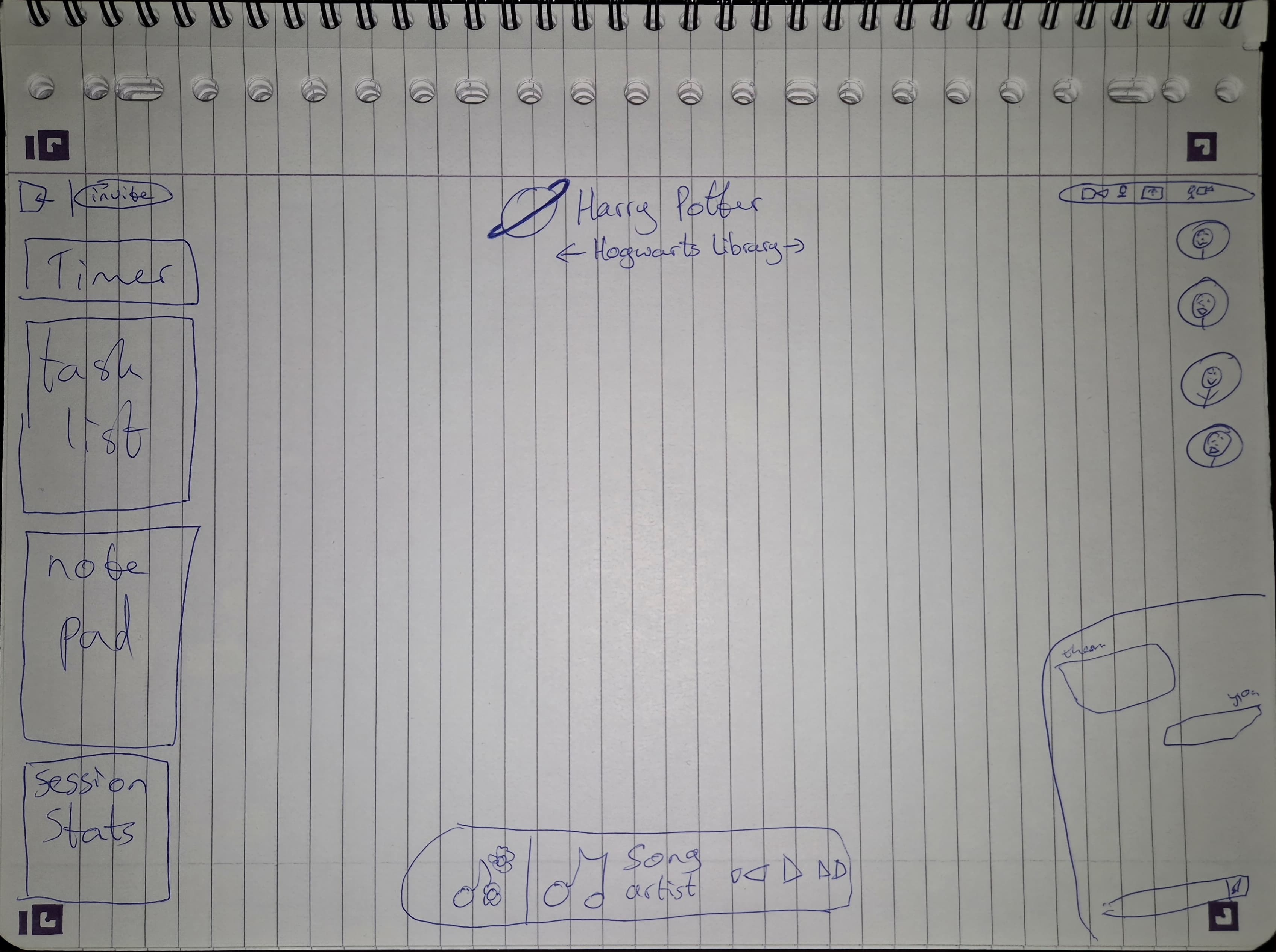
For this first version I wanted to focus on the core features of the timer and tasklist.
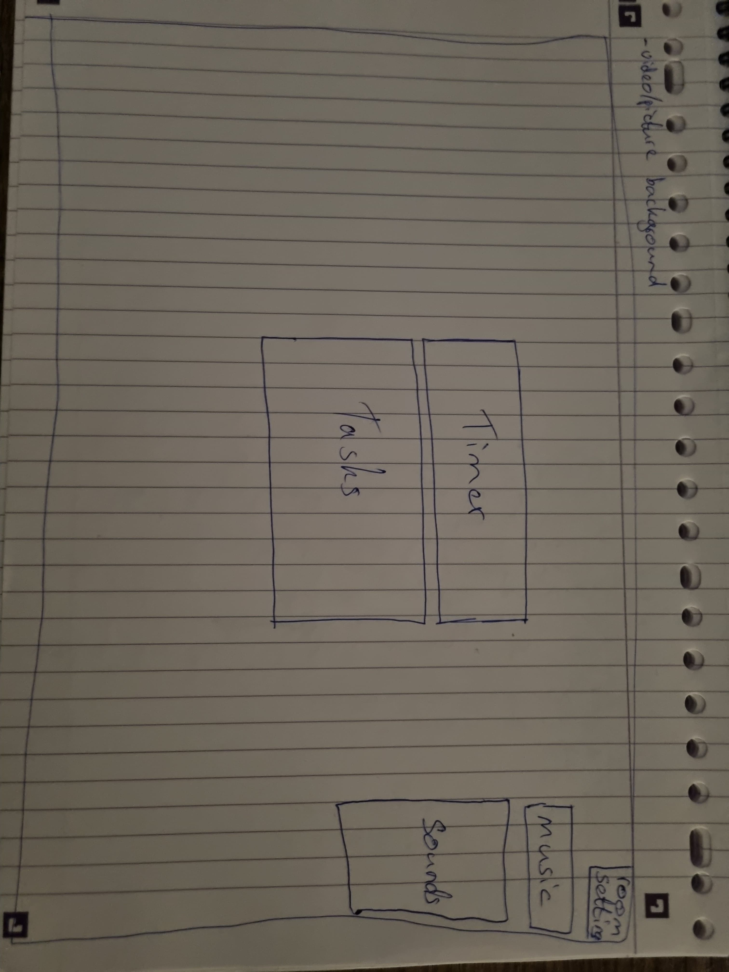
Wireframe Version 1
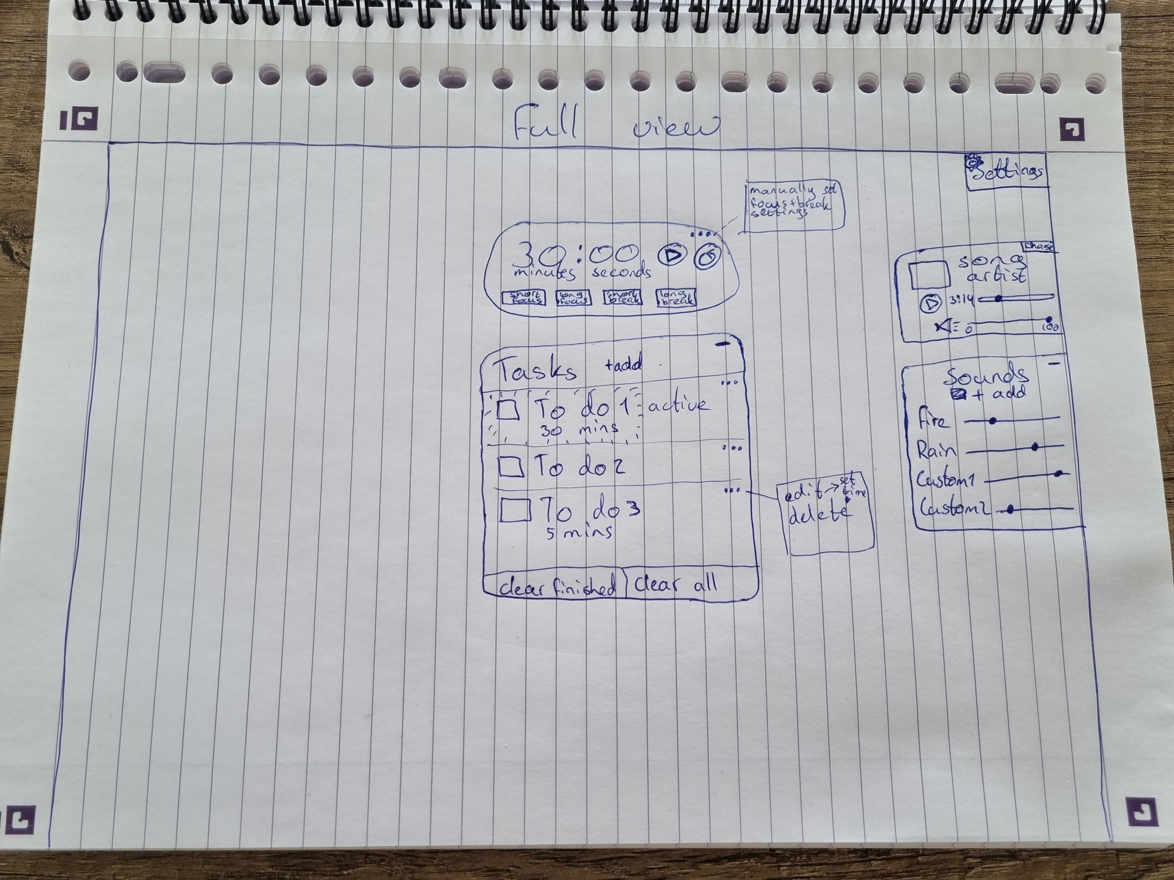
More detailed wireframe version 1
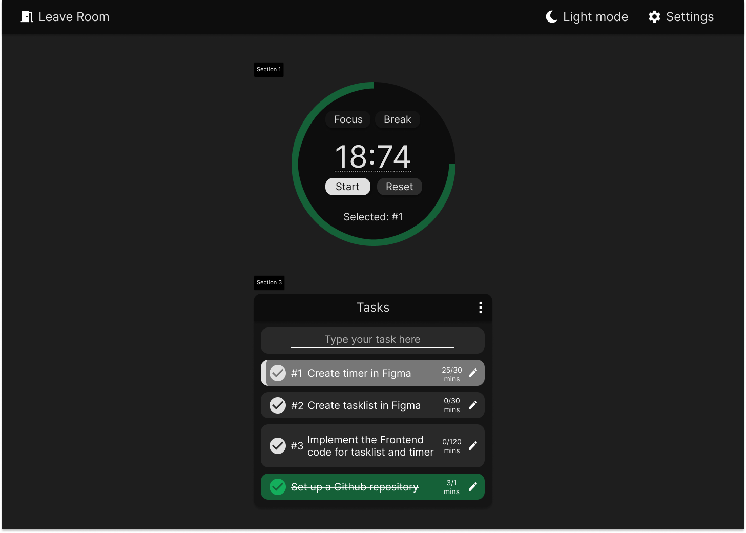
Version 1 Figma design
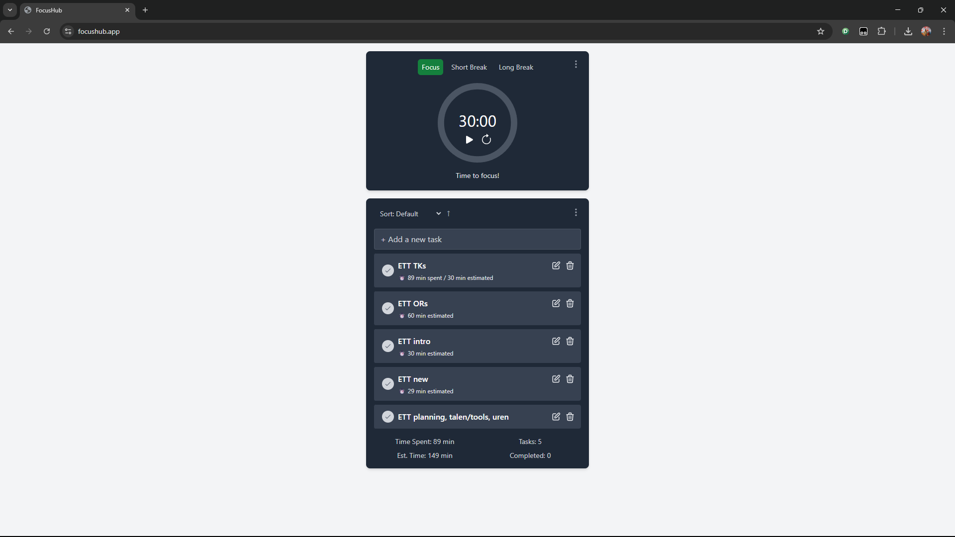
FocusHub screenshot
🔄 Key Realization
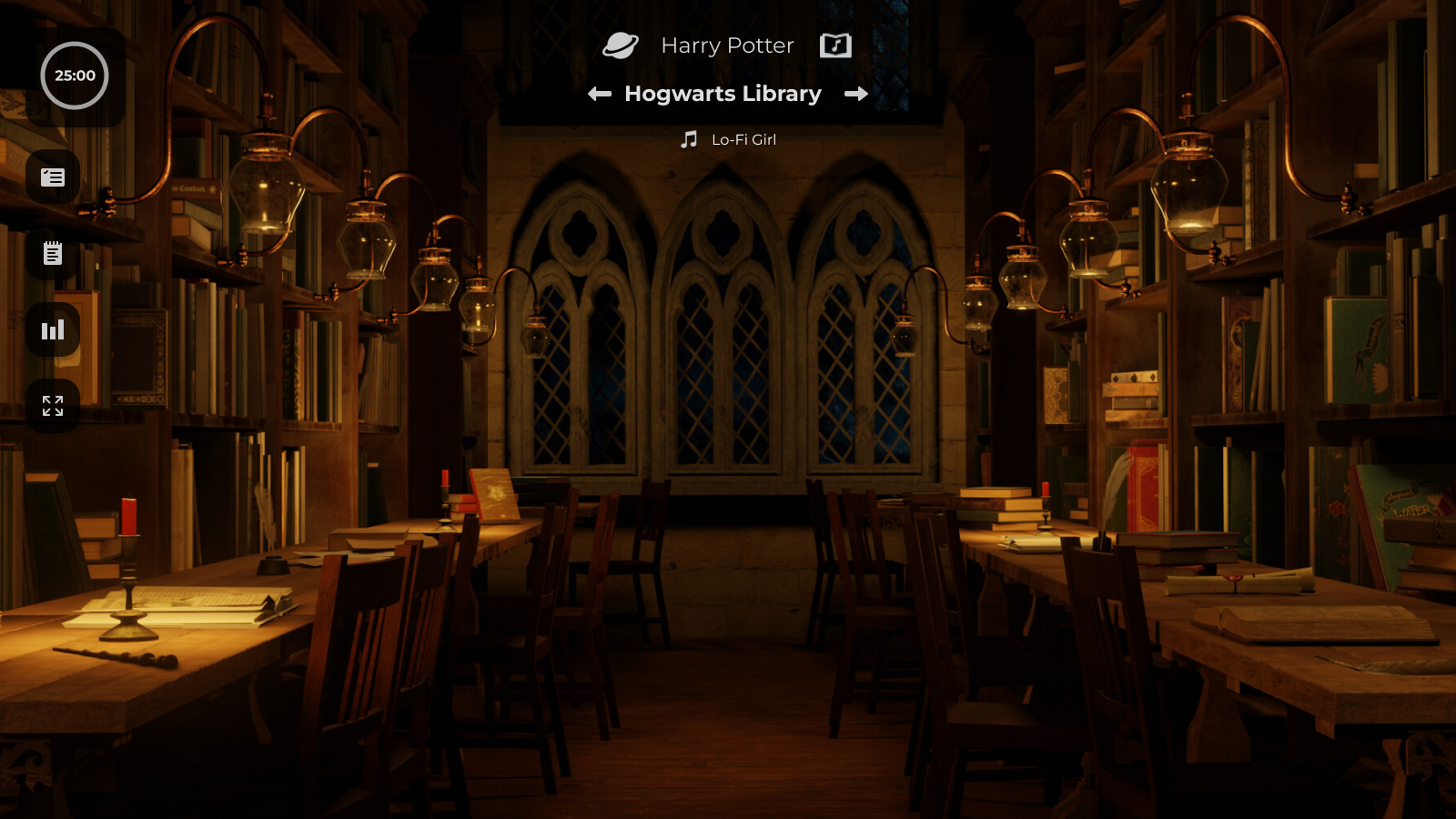
After programming this version, I realized I had gotten away from the original idea of a cozy, immersive environment. Therefore, I decided to create a new version that would focus on the immersive experience, while still keeping the core features.
6. Personal Iteration: First Concept to Second Concept
While still first focusing on the core features, for this second version, I wanted to build on the knowledge gained from the first version and create a more refined and immersive experience.
🔄 Key Realization
- UI elements for the location were still very prominent, blocking the background video. I also still needed clearer buttons for the location and better visibility.
- The design feels cluttered and elements are competing for attention.
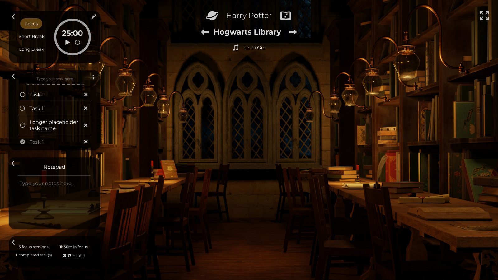
7. Personal Iteration: Second Concept to First Prototype
From the first prototype on, I have been iteratively improving on the design, while programming the core features of the immersive experience as a main focus. I had one continuous user (besides myself) directly testing the programmed application, who was giving on-the-fly feedback on the usability and design.
🔄 Key Realization
- Less UI blocking the background video. Clearer buttons for the location and better visibility.
- Some inconsistencies; minimized timer button is bigger than tasklist; modals not the same sizes.
- Location menu feels overwhelming.
- No visual feedback when changing locations within the universe.
8. Personal Iteration: Redesign First Prototype
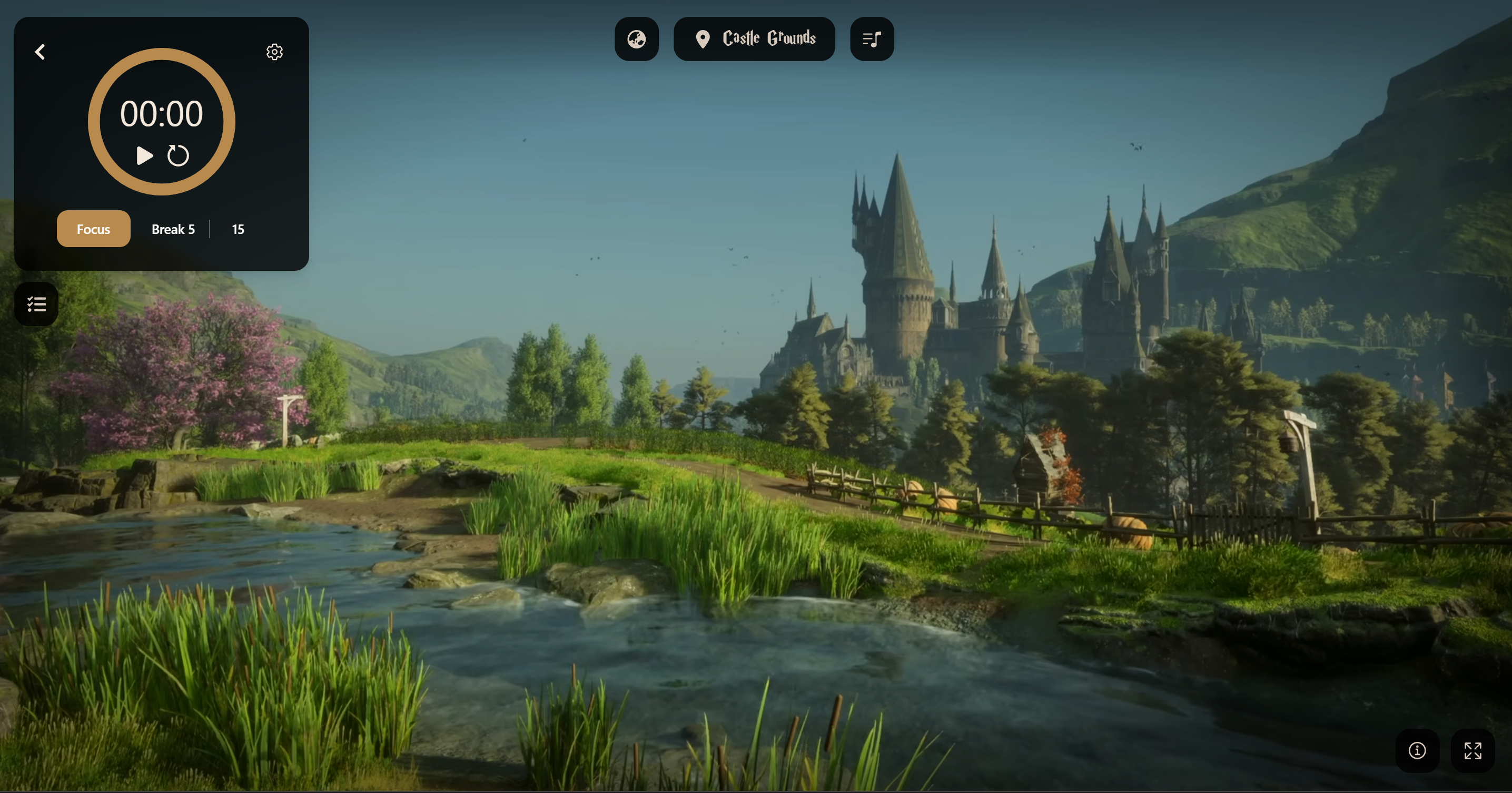
While still iteratively improving on the design with one continuous user to test the prototype, I programmed a big redesign.
Key Decisions
- Glassmorphism for the panels, to let the background video shine for more immersion. Using blur and slight black and white with transparency for better visibility.
- Consistent sizes for same elements.
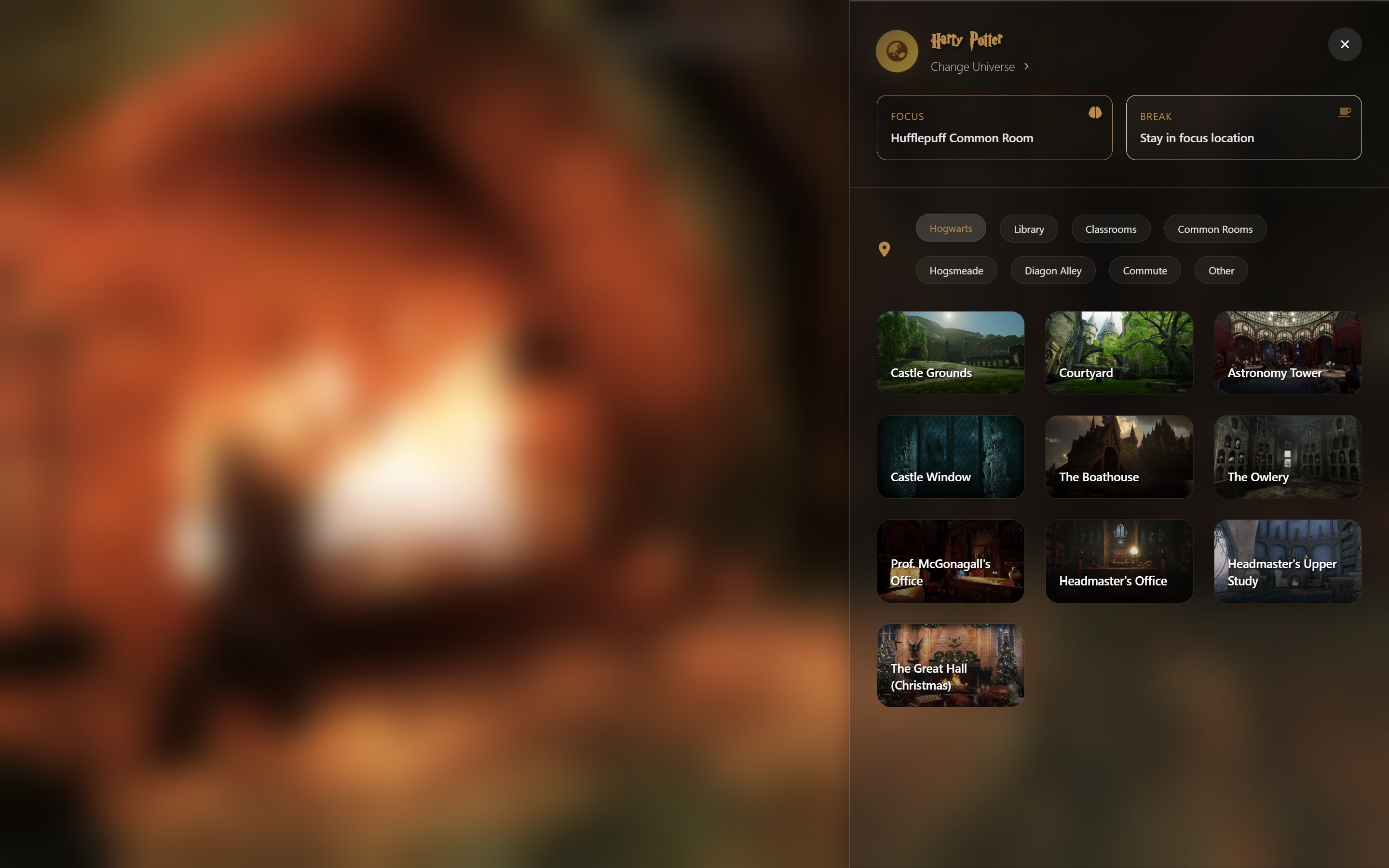
- Introduction of the side menu for locations.
- One sizing for current location element in main UI, truncate long names.
- Added visual feedback when changing locations within the universe and a hover effect to show break and focus session locations.
- Changed thumbnails for locations to screenshots for better cohesion and consistency.
- Added progressbar for tasklist.
🔄 Key Realization
- Still needs clearer buttons for break and focus sessions in location menu.
- Location menu still needs better textual visibility for location names.
- Location menu feels overwhelming.
- No visual feedback when changing locations within the universe.
9. Understanding the User
To build a truly user-centric product, I moved beyond assumptions and dove deep into user wants and needs through research.
My Research Approach
Surveys and interviews W.I.P.
User Surveys
W.I.P.
User Interviews
W.I.P.
Key Research Insights
Insight 1: ""
W.I.P.
Insight 2: ""
W.I.P.
Insight 3: ""
W.I.P.
Persona from Surveys
""
Goals:
Frustrations:
Behavior:
10. Defining the Strategy for M.V.P.
Translating user insights into a concrete product strategy and prioritized development plan.
Requirements
W.I.P.
Feature Prioritization
To balance user impact with development effort, I used a 2x2 prioritization matrix. This allowed me to focus on features that would deliver the most value for our MVP.
Impact vs Effort Matrix
High Impact, Low Effort
- Locations
- Timer
- Task List
- Ambient Sounds
High Impact, High Effort
- AI Assistant
- Multi-user Collaboration
- Advanced Analytics
- Gamification
Low Impact, Low Effort
- Theme Customization
- Sound Effects
- Basic Statistics
Low Impact, High Effort
- Complex Integrations
- Advanced Reporting
- Social Features
11. Designing the Solution
Moving from abstract ideas to tangible, interactive designs through iterative wireframing and prototyping.
User Stories
W.I.P.
5. Testing & Iteration: Closing the Loop
Validating design decisions through user testing and iterating based on feedback.
Testing Approach
W.I.P.
Key Testing Scenarios
- W.I.P.
Critical Findings
Finding 1:
Issue:
Solution:
Finding 2:
Issue:
Solution:
6. Final Outcome & Reflection
Measuring success and planning for the future of FocusVerse.
Challenges & Learnings
🔄 Key Learning: Get Feedback Early, Iterate Often
7. Let's Connect
Thank you for reading! I'd love to discuss this project or potential opportunities.
Get in Touch
More About Me
My multidisciplinary background as a software engineer, UX designer and stakeholder contact, gives me a holistic view of the product development process.I'm passionate about creating tools that genuinely improve people's daily lives. I combine user research, strategic thinking, and design craft to build products that are both useful and delightful.